Tim's Game Art
Wednesday, January 23, 2008
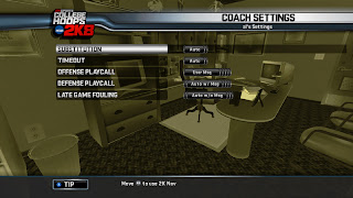
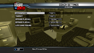
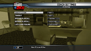
Office Backdrop Interface
This was a menu interface environment with a n animated camera. All the textures are gray & the geometry has vertex alpha. The screen takes on a tint from the primary color of the team/school you've chosen to coach in legacy mode. With that said, I don't know what school is "olive drab", but I think this just read better on my screen than some colors.
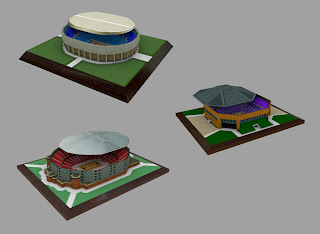
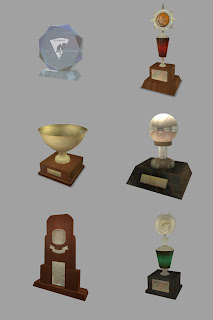
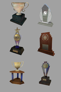
Trophies & Arena Replicas
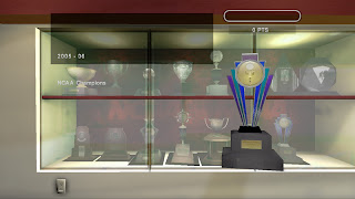
These are some trophies I modeled mapped & lit for this years College Hoops 2k8. The first image is a screen shot from a 360 test build & the remainder are screen grabs from Maya. I tried to re-use wood & stone textures for multiple trophies & I lit most of the trophies in the same scene to generate a single ambient occlusion & lightmap so my scene didn't exceed its load size.
Sports Logo Designs
 These are a couple logos I did recently for a create a team feature from a list of fictitious school mascots (River Rats & Goblins). These were fun to design. I hadn't had the opportunity to work in Illustrator in a long time. I limited myself to a maximum of four colors plus black & white. I'd like to do more of these for fun. I think it would be a good idea to limit myself to less colors in order to strengthen my design skills.
Chunky House, Well
 These were a couple environment assets for the same project. I think my Art Director (amongst others) was enamored with the style we'd seen in the screen shots of the then yet to be released World of Warcraft. These aren't quite as stylized, but I've employed a slightly chunky look with exagerated tapering.
Horses

These were for the same aforementioned MMORPG (Ninth Domain was the working title). I had a budget of slightly over 2000 polygons (tri's) for these babies. I modeled the Clydesdale first & then adjusted the proportions for the trimmer horse on the right. I used the 3d paint tool in Maya to rough out the textures & then polished them in Photoshop.
Bug & Bucket-head

These were a couple characters I'd modeled for a never to be released MMORPG I worked on in 2003. It's a shame. It was sort of a dream team of artists I'd never worked with in my years at Sierra On-Line.
These are fairly low poly. The bug creature is aprox. 1400 & the big metal guy is slightly heavier. These were a couple of the 1st models I'd done (for production) since switching from Max to Maya.
Dog concept & model

This was a dog concept I did for a job submission. After approval, they (Konami) asked me to model the dog using a specific poly count & specific number of texture maps & sizes. I'm guessing it was something like 1200 faces. This was back in 2002. I think it landed me a phone interview but I didn't get any further. Anyway, I went ahead & made a little alley environment to do a walk cycle in. The animation is nothing to write home about, but it gave me a chance to make a mini environment based on some of the alleys I'd traversed in Santa Monica.


